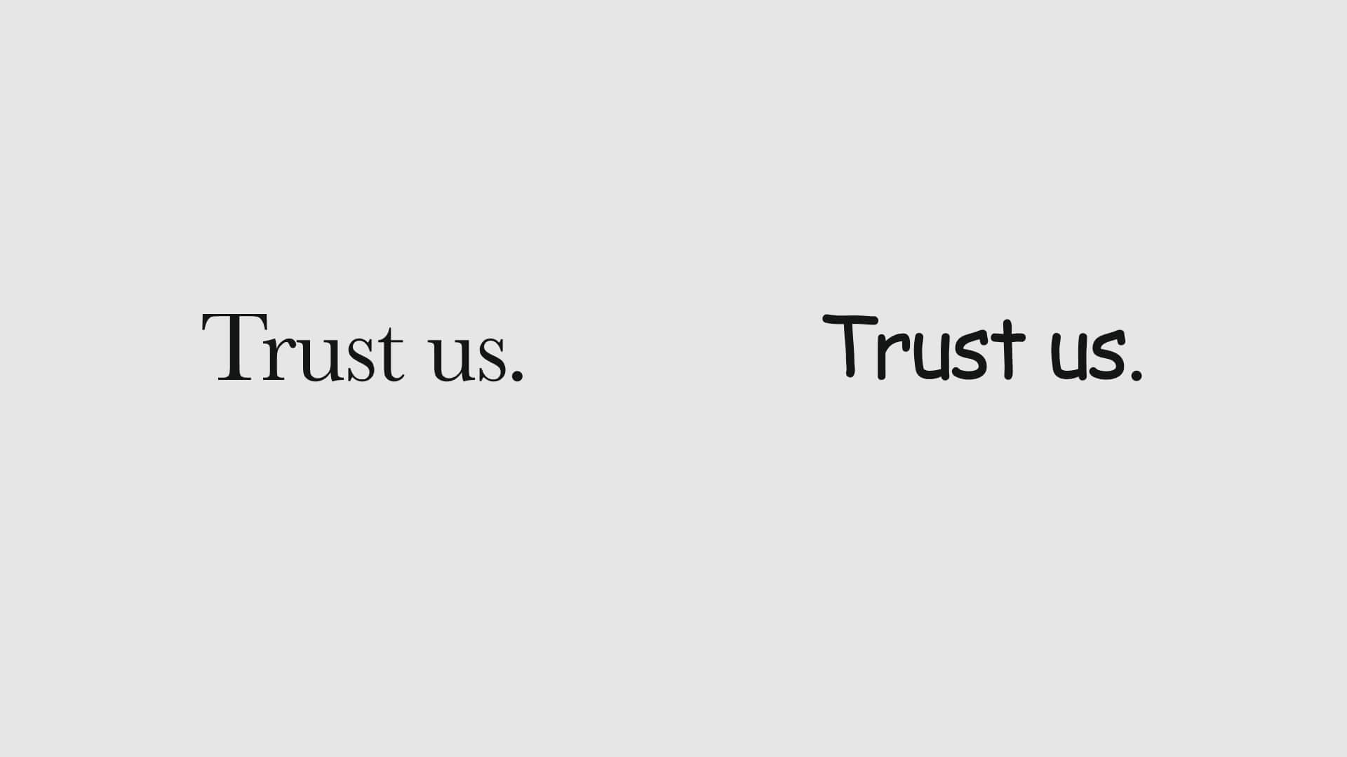
If you’re in the know around here then you totally get that learning typography is an essential skill every designer should have. But have we mentioned just how influential it can be? Yep, yep!
Whether you want to know why you should learn typography or you need some talking points for a particularly stubborn client who’s married to default styles and large blocks of text (yes, that client), you’ve come to the right place.
Ready to learn the not-so-secret secrets of typography’s influential prowess? Let’s do it!
(Type)face Value
Let’s first take typography at face value. When it’s done well, it just looks nice. Makes sense, right?
And if it looks nice, we want to see more of it, we pay attention to it, and we remember it- specifically as something positive.
Even if that was all there was to the persuasive power of typography, those effects alone could tip the scales in your client’s favor and lead to higher conversion rates.
But it doesn’t “just” look nice. If you look a little closer, there are brains behind that beauty.
Typography Communicates Tone
Good typography influences readers by setting the right tone for the content or copy.
Everything about the text, from the softness or sharpness of the shapes in the font, to the colors, the size of the letters, and yes, even the number of lines and spacing in each paragraph, tells the reader what tone of voice to read the message in.
As Frank-N-Furter would say, "Don't dream it, be it." Or, in this case, create it!
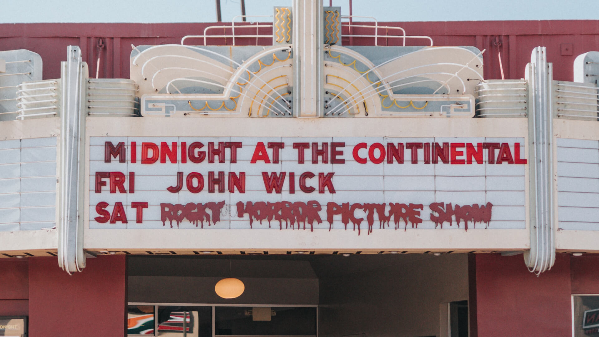
If a reader misinterprets the intent behind what’s being said, the message will evoke an entirely different reaction than what was intended. Can you think of other typography choices the folks behind The Rocky Horror Picture Show could have used that would have completely changed the vibe?
Typography Evokes Emotion
The tone of a message absolutely tells the reader how to feel, but so do… a bunch of other things!
Color Theory
As designers, we have a good grasp of the art and science behind color theory. When designing a new logo or interior space, for example, you consider the mood you want to set and the colors you’ll use (and avoid!) to set that mood.
Apply those same principles to typography and BAM! Game = changed.