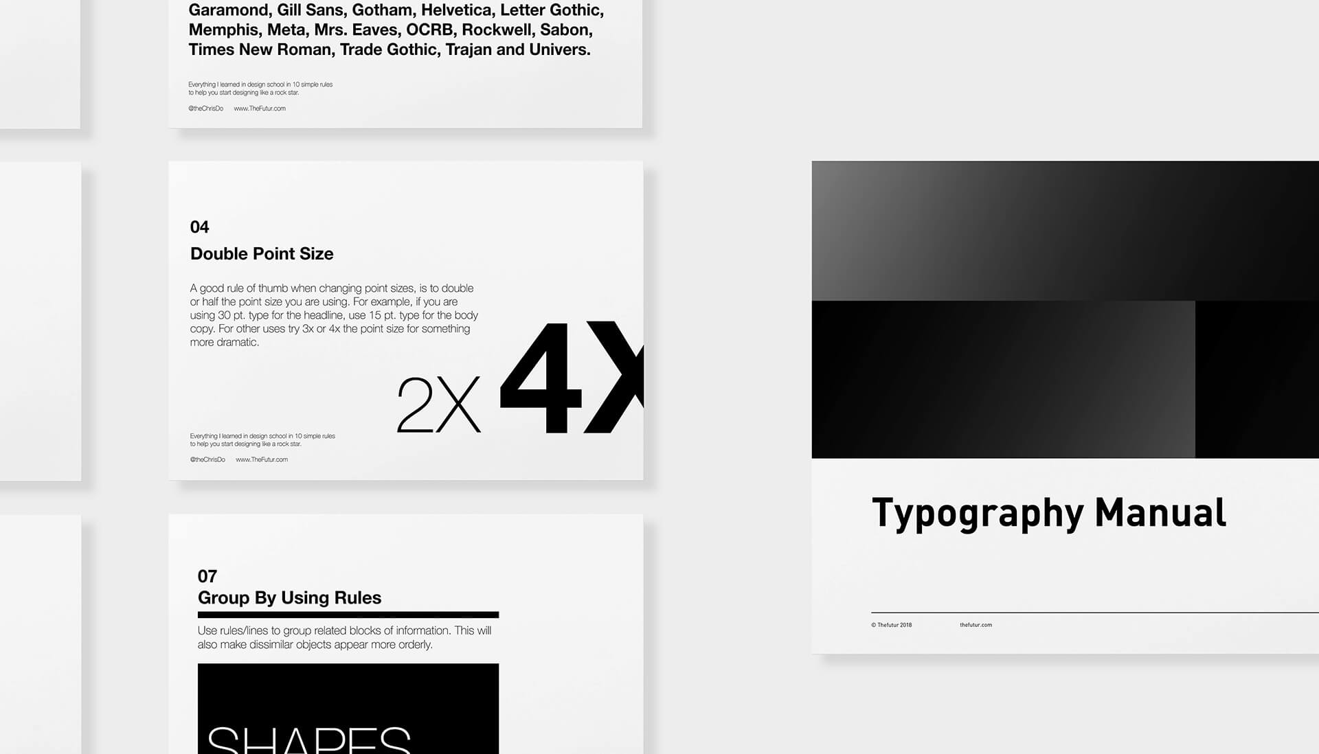
Knowing how to do typography design is crucial if you want to set yourself apart from the crowd as a designer and elevate your design to new heights. Carving out time to learn something new can be daunting, though.
Wouldn’t it be great if there were CliffNotes for typography? They could help get you started, guide your learning, or just give you a refresher every time you need one. If only, if only… But, wait! Don’t despair!
The world may not have CliffNotes for typography, but we have something better.
(drum roll)
ChrisNotes!
Or, actually, a free download of everything Chris learned in design school, distilled into a handy dandy ten-part manual. It’s useful, it’s short, and it’s pretty sweet if you ask us! We like it so much that we animated it, too.
Here are ten (super) quick tips for great typography:
Justify Left
In Western culture, people read top to bottom, left to right, so justify your text left. This makes it easier for the person reading to navigate through the copy.
Use One Font
Certain typefaces can carry different meanings and interpretations. Keep things simple and stick to one font to avoid messing with the complements of the typeface.