Be The First To Know
Join Our Newsletter


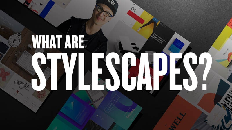
Learn Typography Fundamentals
It’s mysterious, even intimidating for some.
This isn’t an experience that I’ve imagined. It’s one that I’ve gone through personally.
As a young student studying graphic design at ArtCenter College of Design, I felt intimidated by the work that I saw in the student gallery. After all, this was some of the best, most progressive work that was on display. I remember walking by the gallery and thinking to myself, one day, I hope my work will be as good as the work that I saw.
Perhaps you can relate. Maybe you’ve seen a few portfolios on Behance or Pinterest and thought the same thing. How is it that someone, who has access to the same tools, fonts and images as me, can do such incredible work? What’s the difference? How did they learn typography? What makes them so special and me less so? The answer came to me in the form of a petite, well dressed man with a British accent. His name was Simon Johnston and I was fortunate enough to have him as my Type I instructor. I didn’t know it then, but that class was about to fundamentally unlock the mysteries of design to me and my fellow classmates. I would actually learn how type works.
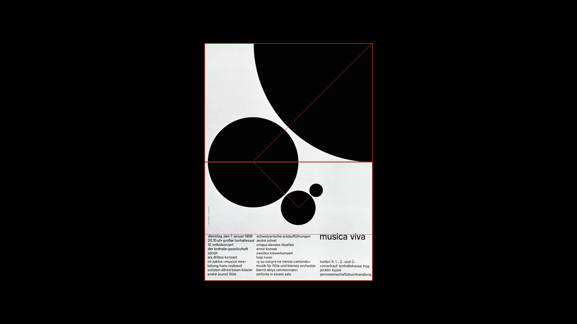
The first assignment he gave was perfectly designed. It taught us the principles of typography: legibility, alignment, contrast, spacing, scale, proportion and balance. I would later learn that the assignment that he gave us was the same one given at the Basel School of Design — founded by legendary designers Armin Hoffman and Emil Ruder.
As I completed each week’s assignment, I felt my skill and confidence with type grow. It was an amazing feeling. I could now look at books that featured amazing designers, and feel that I knew the invisible principles at work. I could see the grid structure. I felt like Neo in the Matrix when he was first able to see the code that made up the virtual world. It was truly exhilarating.
After that semester, I remembered returning to the student gallery and looked at the work again. My feeling had changed. Don’t get me wrong, the work was still amazing, but now, instead of wishing to do work as good as what I saw, I realized that great work was achievable. In that moment, a quiet, introverted student, became a confident designer, eager to apply his knowledge to all kinds of design problems.
Learning about type and typography taught me about space and proportion, something that could be applied to virtually anything. I’ve used what I learned to design furniture (book shelves, desks, etc…), building facades, interior spaces and everything else that has a visual form.
Now, years have passed, and I’m running a motion design studio. But the one thing that keeps coming up, with the influx of new designers to our shop, is that they lack some of the fundamentals of typography—they lacked the same knowledge that I got so many years ago. I would sit down with my designers, help them learn typography, and go over basic principles with them. At one point, I even conducted classes at our office to train our staff in typography.
After doing this for a few years, I got tired of saying the same thing over and over again as each new wave of designers came into our office. One night, I sat down and wrote a few key tips on typography. This document turned into the “Typography Manual,” which then turned into an animated video. Surprisingly, the video took off on Facebook garnering over 350k views and 10k shares. We touched a nerve.

I started to get emails and messages telling me how they learned more about using type in that one document/video than every other source combined. Wow! That’s pretty cool. I got more messages asking for book recommendations and courses to take. Honestly, I didn’t know of such a resource. There were good books on the history of type, grid structure, but I didn’t know of a single resource that actually helped people learn typography the way I learned it.


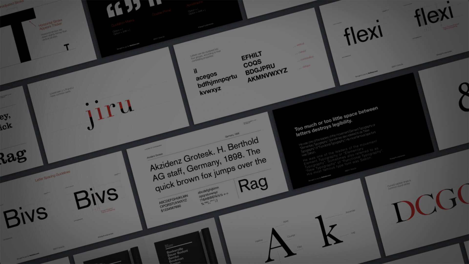
This has led me to where we are today—the creation of the Design Fundamentals series. It’s a four part course on Typography (repetition and contrast, grid construction and application, typographic details and optical adjustments, and layout) with live work sessions (typography posters) where you actually get to see and hear us work through a design problem. I’ve combed through books, done the research, and applied everything that I’ve learned about typography in this one class. The Typography course answers these fundamental questions:
- What typeface should I use? Do you have recommendations?
- How is the Golden Ratio calculated?
- What is the Fibonacci series and how do I use it?
- How do I use grids in my layout?
- What are book recommendations where I can learn more?
- Why are certain characters drawn that way? They look odd to me?
- How do I achieve optical balance in designing logos and letterforms?
- How do I mix typefaces?
- + more
In a way, it’s my attempt to recreate the learning experience that I had at Art Center. Hope you enjoy and let me know what you think.
You can support the Futur, and learn typography by purchasing the course now.
Learn Typography Fundamentals
For many people, trying to learn typography is a dark art. It’s mysterious, even intimidating for some.
For many people, trying to learn typography is a dark art. It’s mysterious, even intimidating for some.
It’s mysterious, even intimidating for some.
This isn’t an experience that I’ve imagined. It’s one that I’ve gone through personally.
As a young student studying graphic design at ArtCenter College of Design, I felt intimidated by the work that I saw in the student gallery. After all, this was some of the best, most progressive work that was on display. I remember walking by the gallery and thinking to myself, one day, I hope my work will be as good as the work that I saw.
Perhaps you can relate. Maybe you’ve seen a few portfolios on Behance or Pinterest and thought the same thing. How is it that someone, who has access to the same tools, fonts and images as me, can do such incredible work? What’s the difference? How did they learn typography? What makes them so special and me less so? The answer came to me in the form of a petite, well dressed man with a British accent. His name was Simon Johnston and I was fortunate enough to have him as my Type I instructor. I didn’t know it then, but that class was about to fundamentally unlock the mysteries of design to me and my fellow classmates. I would actually learn how type works.
The first assignment he gave was perfectly designed. It taught us the principles of typography: legibility, alignment, contrast, spacing, scale, proportion and balance. I would later learn that the assignment that he gave us was the same one given at the Basel School of Design — founded by legendary designers Armin Hoffman and Emil Ruder.
As I completed each week’s assignment, I felt my skill and confidence with type grow. It was an amazing feeling. I could now look at books that featured amazing designers, and feel that I knew the invisible principles at work. I could see the grid structure. I felt like Neo in the Matrix when he was first able to see the code that made up the virtual world. It was truly exhilarating.
After that semester, I remembered returning to the student gallery and looked at the work again. My feeling had changed. Don’t get me wrong, the work was still amazing, but now, instead of wishing to do work as good as what I saw, I realized that great work was achievable. In that moment, a quiet, introverted student, became a confident designer, eager to apply his knowledge to all kinds of design problems.
Learning about type and typography taught me about space and proportion, something that could be applied to virtually anything. I’ve used what I learned to design furniture (book shelves, desks, etc…), building facades, interior spaces and everything else that has a visual form.
Now, years have passed, and I’m running a motion design studio. But the one thing that keeps coming up, with the influx of new designers to our shop, is that they lack some of the fundamentals of typography—they lacked the same knowledge that I got so many years ago. I would sit down with my designers, help them learn typography, and go over basic principles with them. At one point, I even conducted classes at our office to train our staff in typography.
After doing this for a few years, I got tired of saying the same thing over and over again as each new wave of designers came into our office. One night, I sat down and wrote a few key tips on typography. This document turned into the “Typography Manual,” which then turned into an animated video. Surprisingly, the video took off on Facebook garnering over 350k views and 10k shares. We touched a nerve.
I started to get emails and messages telling me how they learned more about using type in that one document/video than every other source combined. Wow! That’s pretty cool. I got more messages asking for book recommendations and courses to take. Honestly, I didn’t know of such a resource. There were good books on the history of type, grid structure, but I didn’t know of a single resource that actually helped people learn typography the way I learned it.
This has led me to where we are today—the creation of the Design Fundamentals series. It’s a four part course on Typography (repetition and contrast, grid construction and application, typographic details and optical adjustments, and layout) with live work sessions (typography posters) where you actually get to see and hear us work through a design problem. I’ve combed through books, done the research, and applied everything that I’ve learned about typography in this one class. The Typography course answers these fundamental questions:
- What typeface should I use? Do you have recommendations?
- How is the Golden Ratio calculated?
- What is the Fibonacci series and how do I use it?
- How do I use grids in my layout?
- What are book recommendations where I can learn more?
- Why are certain characters drawn that way? They look odd to me?
- How do I achieve optical balance in designing logos and letterforms?
- How do I mix typefaces?
- + more
In a way, it’s my attempt to recreate the learning experience that I had at Art Center. Hope you enjoy and let me know what you think.
You can support the Futur, and learn typography by purchasing the course now.

Chris Do is an Emmy award winning director, designer, strategist and educator. He’s the Chief Strategist and CEO of Blind, executive producer of The Skool, and the Founder and CEO of The Futur— an online education platform that teaches the business of design to creative thinkers.